I had the pleasure of working alongside Nimbus and was consistently impressed by his ability to bridge the gap between complex information and beautiful design. Whether he was designing graphics for the project’s reports and materials or creating sleek graphics for the website, his work was always polished, on-brand, and delivered on schedule. He has a rare talent for making technical, complex details look engaging and easy to navigate. Any team would be lucky to have him.
Richa Walia
Northwest 35
Nimbus project-managed the development of my website to a very tight deadline and delivered it seamlessly. The design was executed brilliantly, and the build was handled with clarity, strong organisation and excellent communication throughout. A highly reliable partner for time-sensitive web projects.
Channeling my inner artist whenever possible, I bring ideas alive to pixels.
Sometimes I am in the zone, While sometimes…
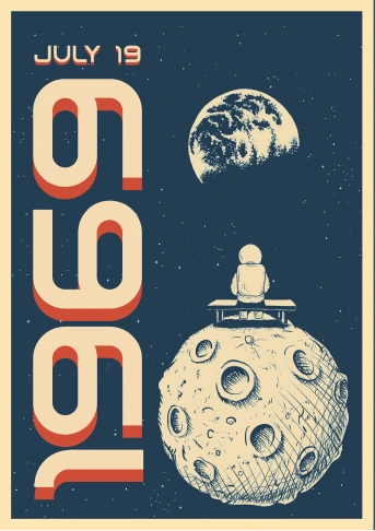
Lastly, reflecting to the thing that started it all...