Nepal Tea works closely with tea farmers across the eastern hilly region selling nepali tea abroad and builds a transparent and ethical tea ecosystem and empower locals.
My role was to translate this philosophy into a cohesive brand and digital system that balances storytelling, culture, and commerce.
PROJECT DETAILS
Type
Design Overhaul
Services
Rebranding, Packaging, UI/UX
Category
Artisan Tea
(02)
Challenge
Bringing depth and meaning into a space that also needed to sell.
The brand carried years of stories, values, and origin-driven content, but the existing experience didn’t fully capture the brand essence.
The challenge wasn’t lack of information but structuring everything in a way that felt calm, trustworthy, and easy to explore, while still functioning as a modern e-commerce platform.
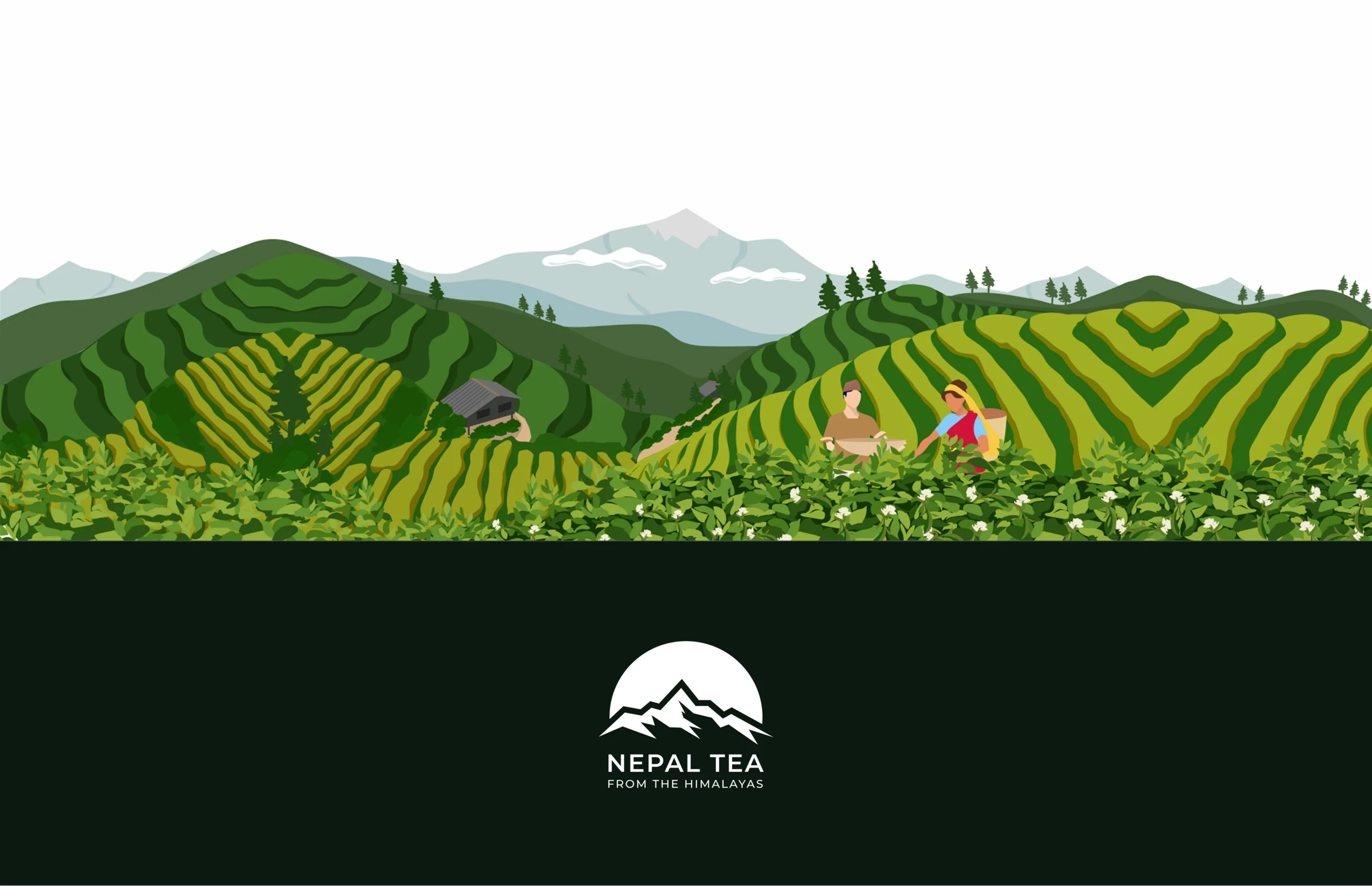
From the himalayas
(03)
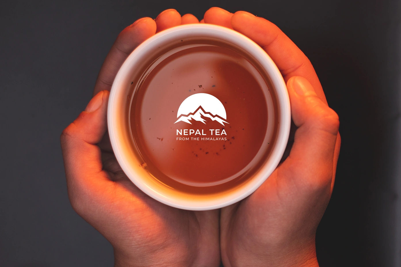
Visual Identity
A mark that connects Nepal, tea, and origin into a single form.
The original identity included mountains; a strong point to reflect Nepal’s geography. We tried multiple iterations to refine this into a mark that felt meaningful to international audiences while staying true to where the tea comes from.
The final logo we concluded to, draws the silhouette of Mount Kanchenjunga and its range; the foothills of the region where Nepal Tea’s primary farms are located; grounding the identity in a real, physical place.
(04)
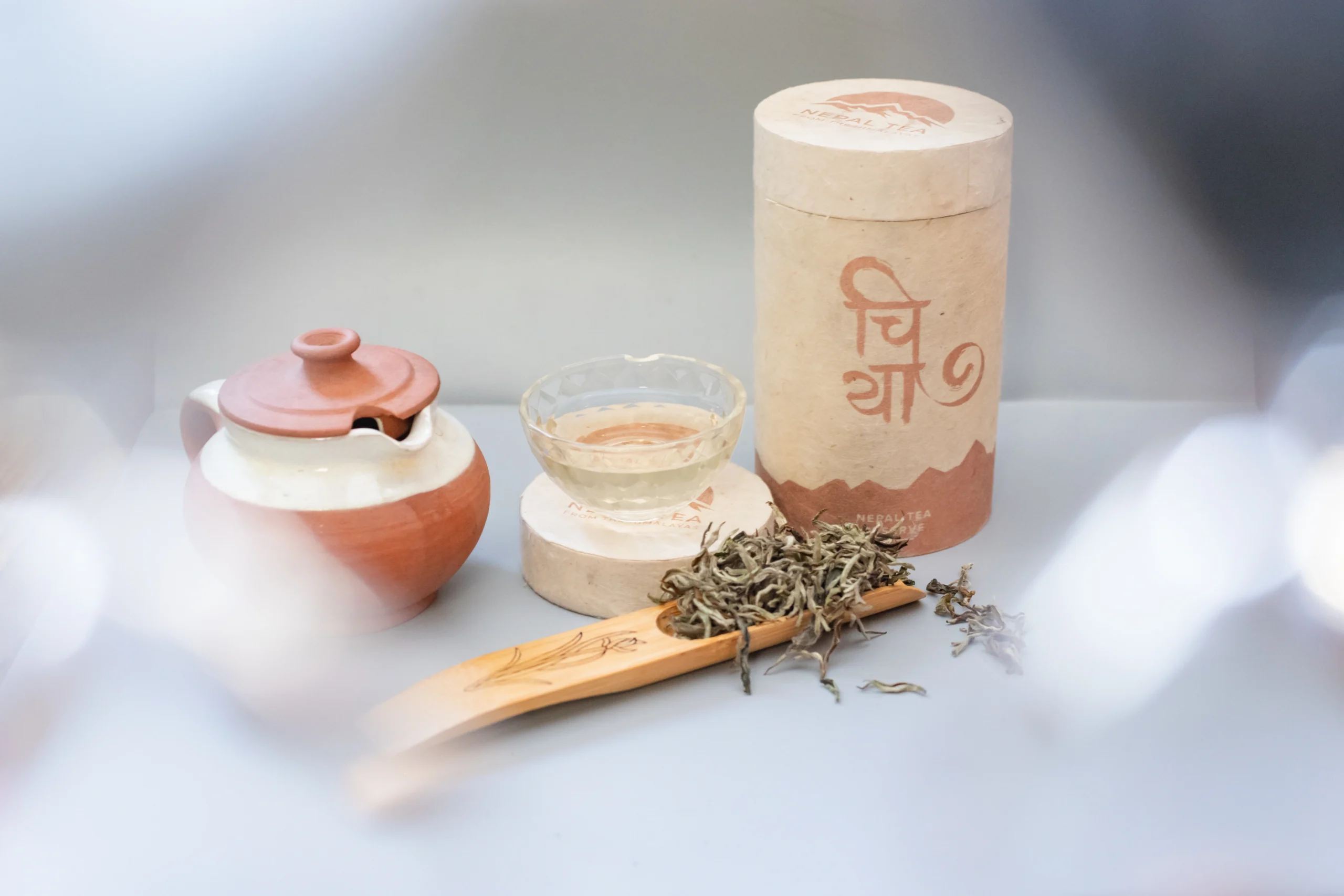
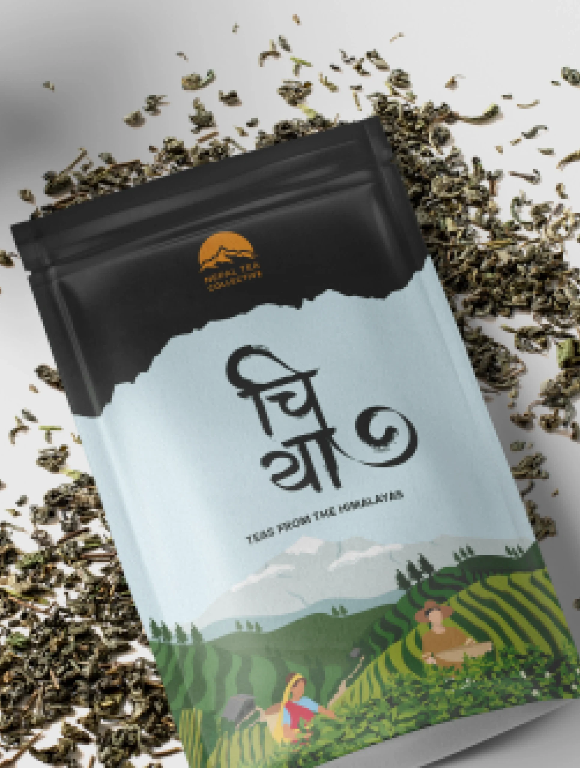
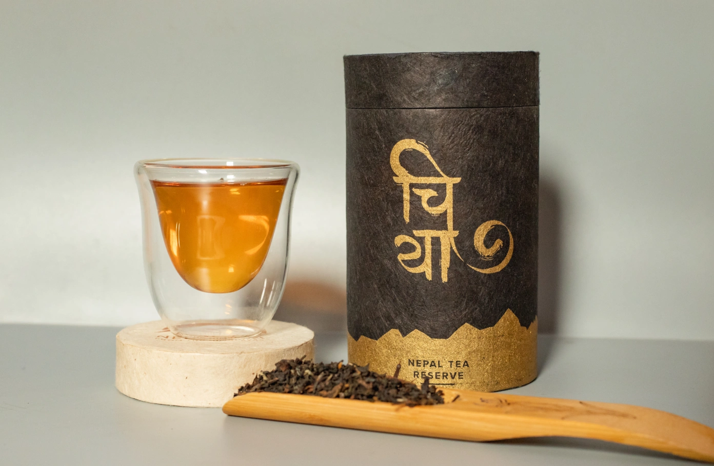
The Chiya Mark
Using typography to bring local culture into a global brand.
“Chiya” (चिया) simply means tea in Nepali. In an attempt to promote Nepali typography, we developed a custom mark that could live confidently alongside the main identity. After multiple iterations and print tests were explored, we came up with a final mark that retains character while working consistently across packaging and brand applications alongside the primary logo.
(05)
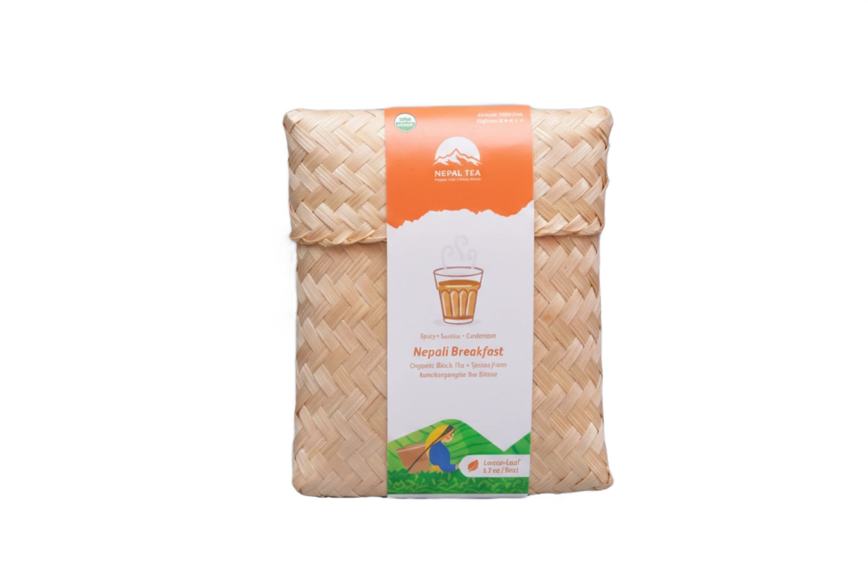
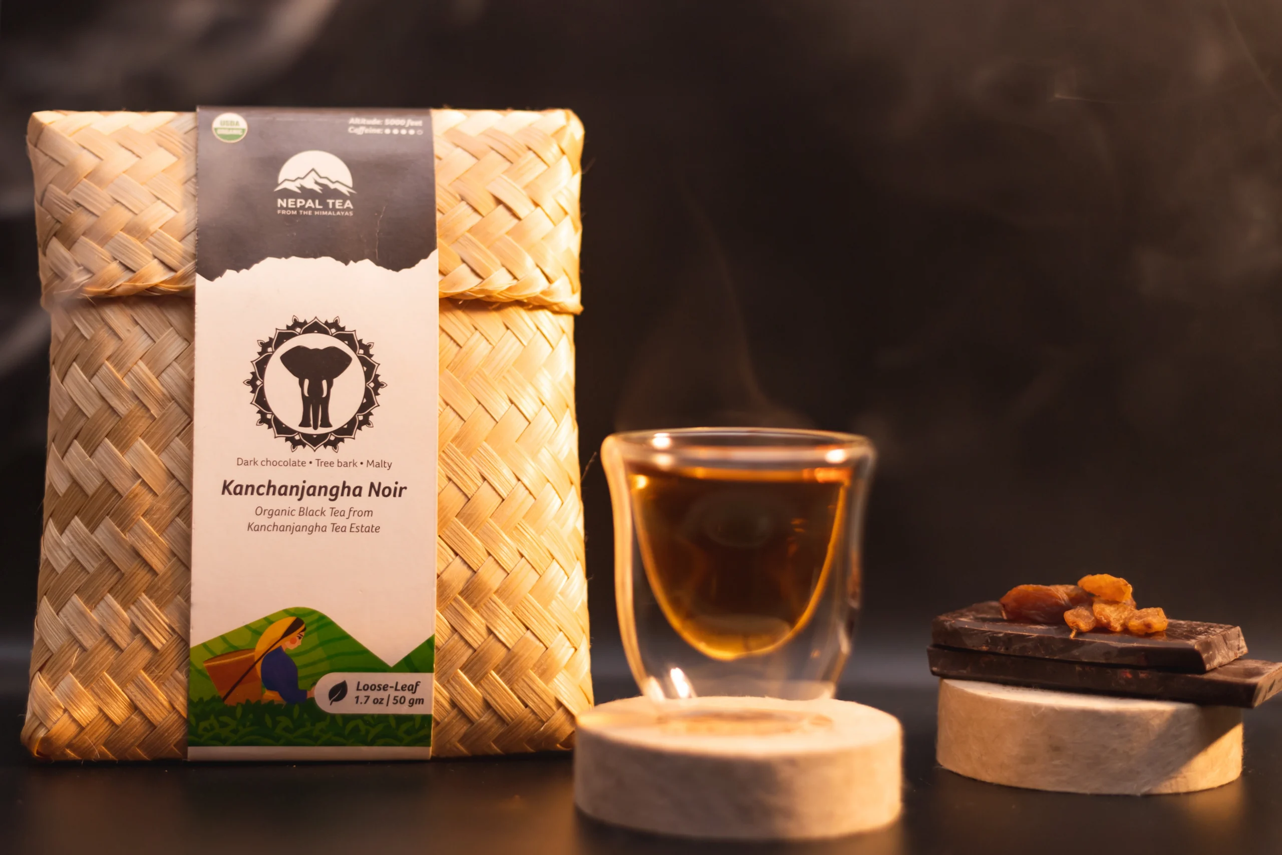
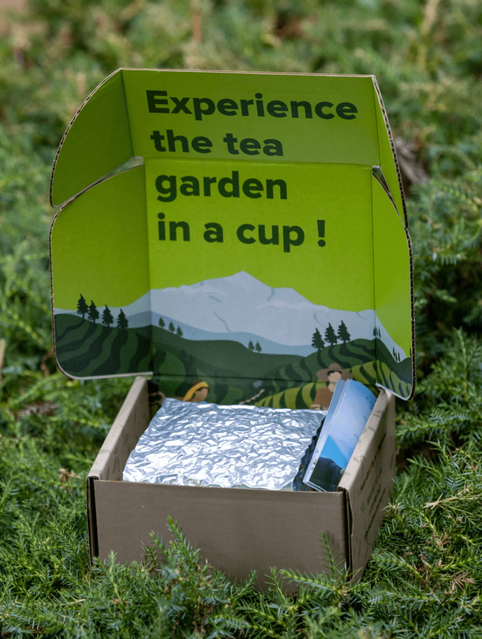
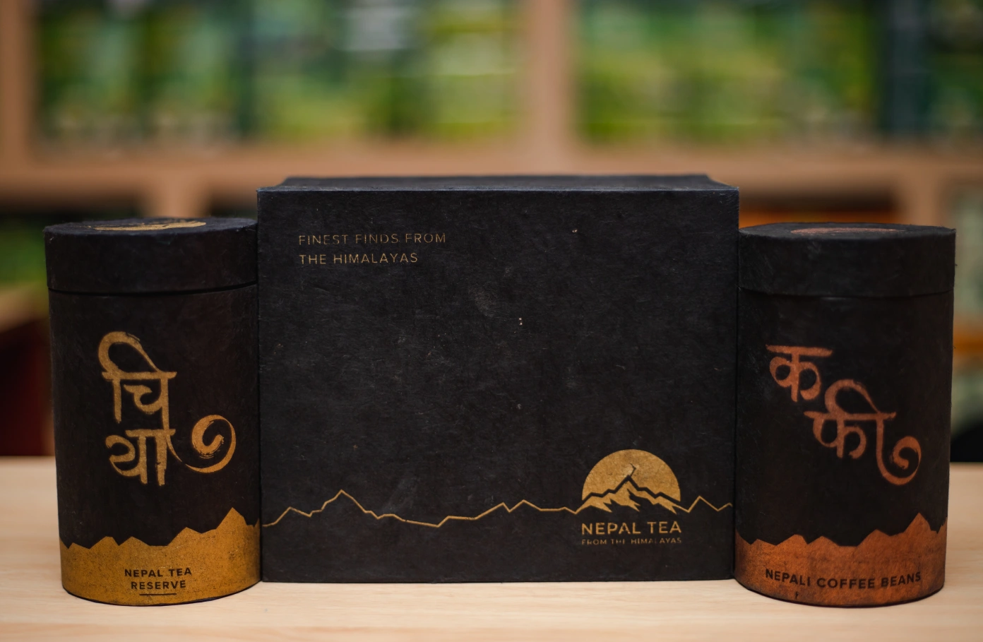
Packaging Tea
Designing within real-world constraints, without losing the brand’s values.
Before the redesign, Nepal Tea used handmade boxes produced by local artisans out of bamboo strips which supported the local communities involved in tea production. Preserving this value felt essential.
Thus, we only updated the label design to align with the new branding. Keeping up with the theme, we also introduced another local product into packaging lineup – Lokta paper packaging, a traditional Nepali material.
While it comes with its own limitations along with and international standard constraints we worked around that to shape the final product which resulted in packaging that promotes Nepali products to the world.
(06)
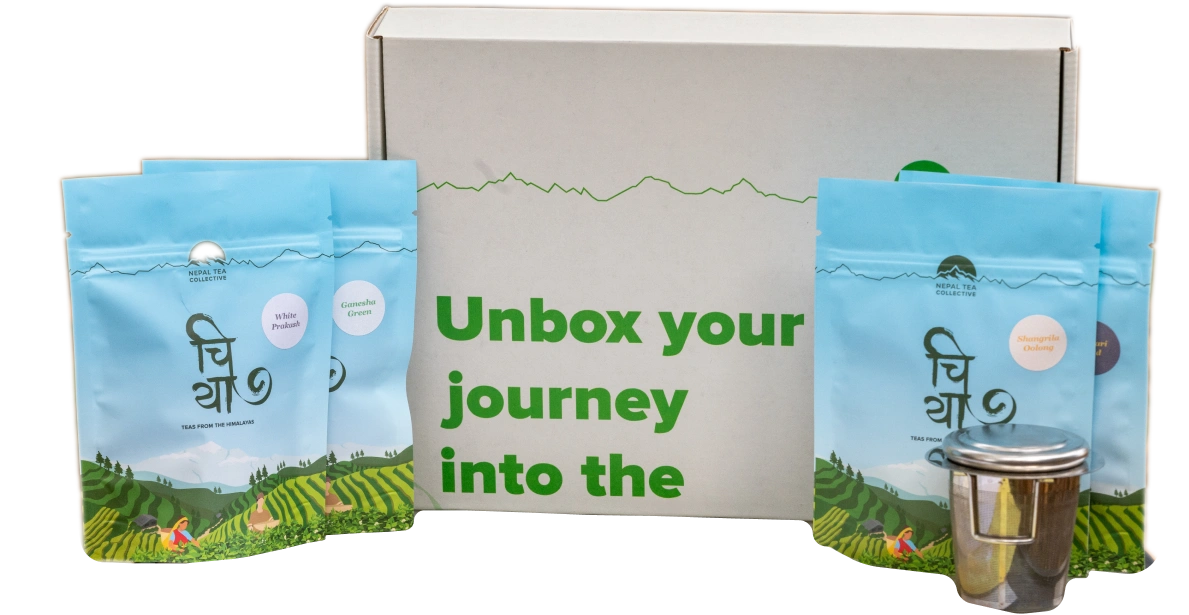
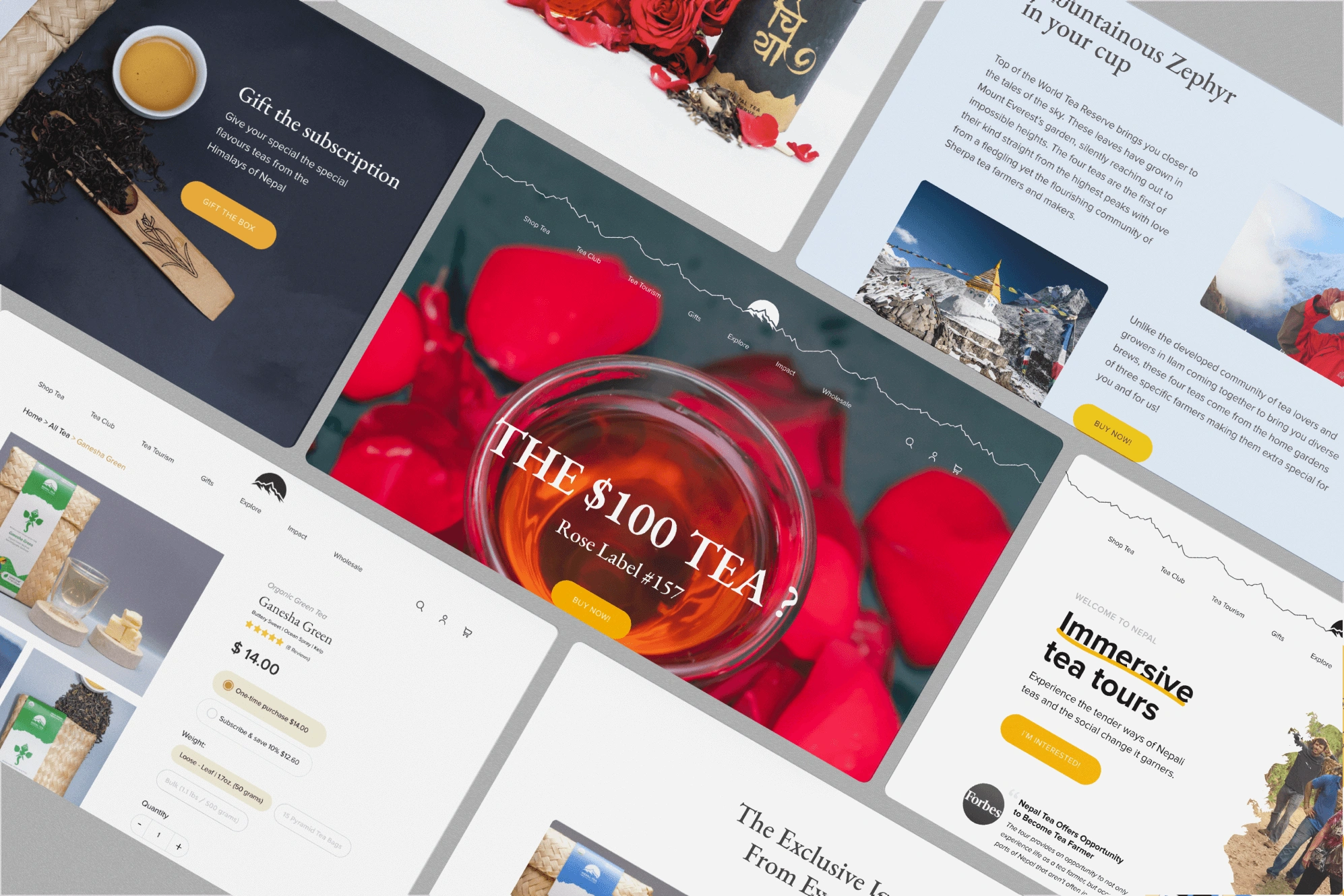
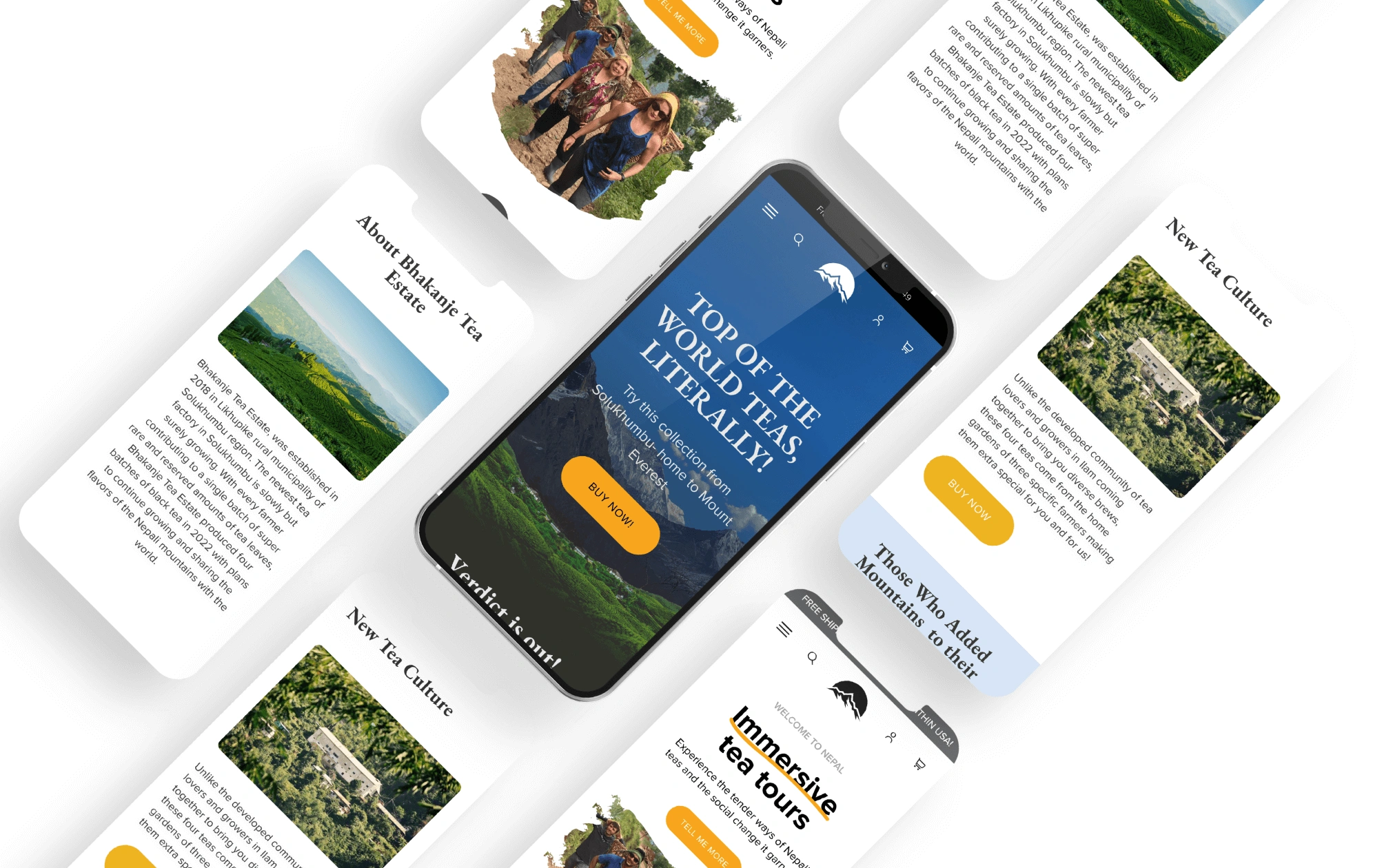
Website Experience
Balancing storytelling with performance-driven commerce.
Nepal Tea’s digital experience needed to do two things at once: communicate its rich backstories and drive sales.
The website was designed around this foundation. Using story driven content along with focused CTAs, we made the tea purchase experience a compelling one. The layouts were made flexible to adapt new releases and limited-edition teas.
This approach allowed the founders to focus on promoting and selling Nepali tea among its growing audience while keeping its backstories intact and experience intentional.