Resimator is a software boutique company based in Turku, Finland; started by Nepali founder and working with global startups and teams who value quality and speed.
As the company evolved, their work had grown more strategic; but the brand hadn’t kept up. Thus the goal of this project was to create a clear, confident identity that reflects how Resimator actually works: as long-term partners, not just technical executors.
PROJECT DETAILS
Type
Rebrand
Services
Branding, Graphic Design, UI/UX
Category
Boutique Software Studio
(02)
Challenge
A brand in need of a confident voice.
Resimator’s previous identity felt dated and inconsistent across platforms. While the company had matured in how it thought and worked, the brand no longer reflected that shift.
The founders weren’t looking for a cosmetic update — they needed a stronger voice, clearer positioning, and a system that could support growth and attract better-aligned clients.
The challenge wasn’t designing a new logo, it was defining how Resimator should show up — visually, verbally, and culturally.
NEPALI ROOTS, NORDIC INFLUENCE
(03)
The Identity
A mark rooted in language and connection.
Being a company with Nepali roots, the decision to incorporate Nepali letter to the identity felt almost natural.
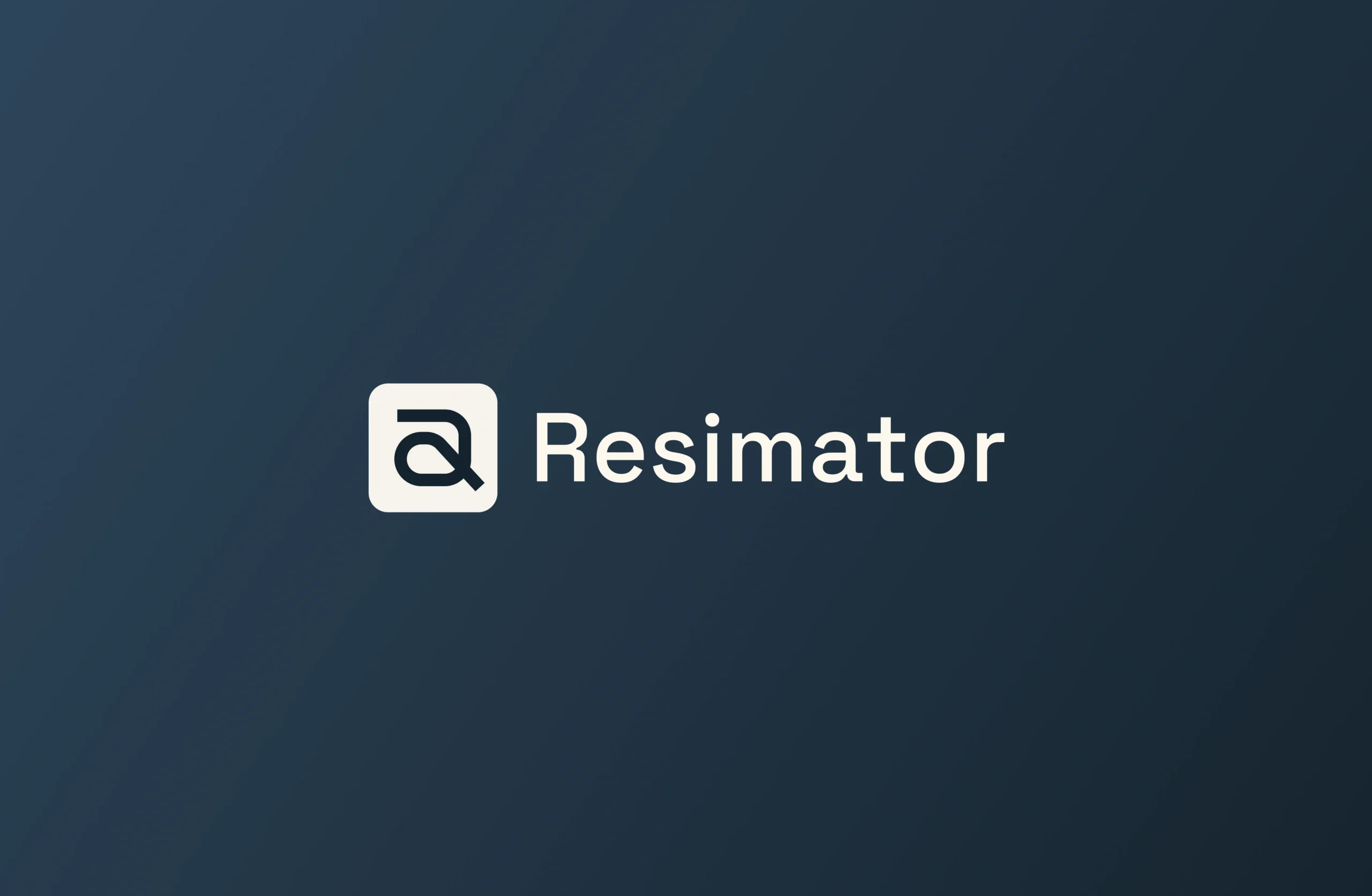
At the center of the identity is the Nepali letter “र” designed in a way that also reflects a half “R”.
“र” represents connection; between people, ideas, and technology. Rather than designing a purely abstract symbol and give some meaning, the approach to create a mark born from language, reflecting Resimator’s roots and its future felt more natural.
The result is a symbol that feels both structured and expressive — precise in form, yet flexible in use.
(04)
System Thinking
Designed as a system, not just a logo.
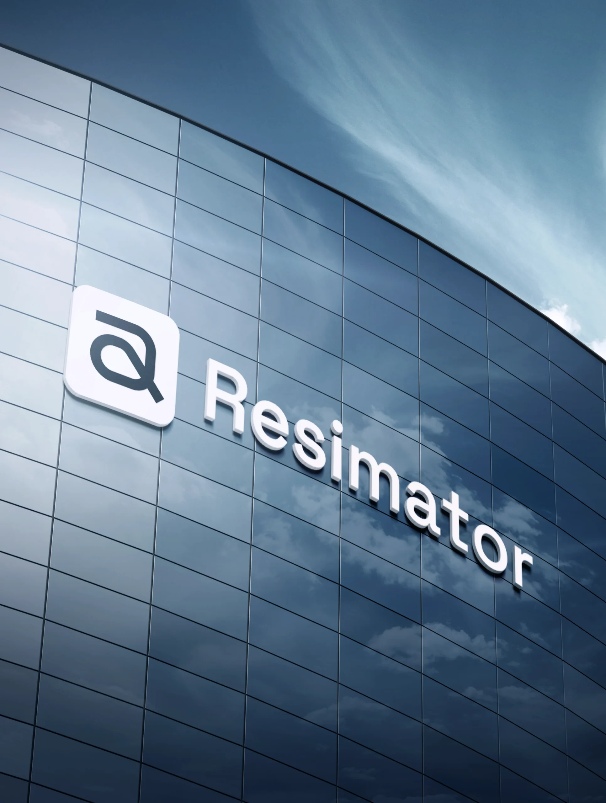
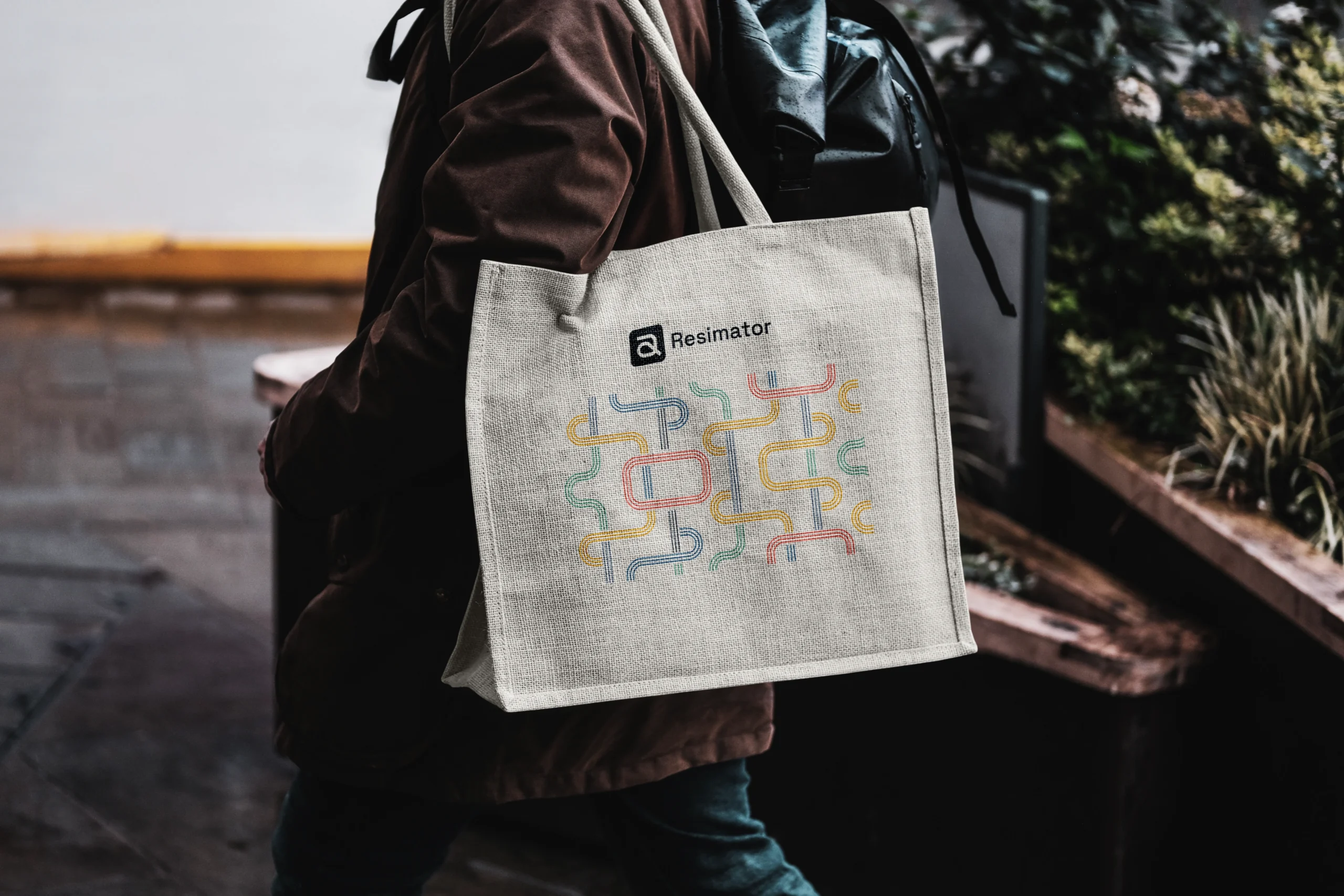
Resimator didn’t need a single visual — they needed a system.
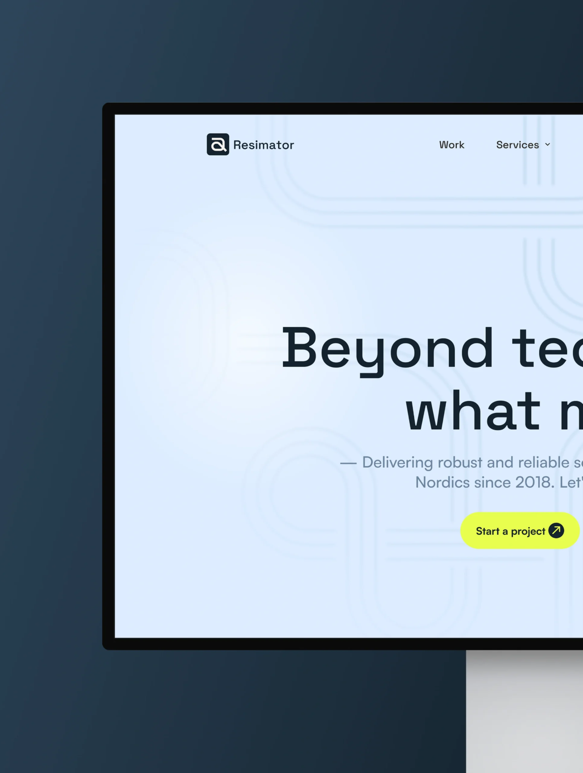
The identity was designed to scale across products, platforms, and communication — from digital interfaces to presentations and social content.
Patterns, typography, and layout rules work together to create consistency without rigidity, allowing the brand to adapt while staying recognizable.
The Voice Pillars
Keeping things simple, thoughtful, and human.
(01) Smart
Clear thinking, explained simply
Instead of explaining every technical detail upfront, we focus on what matters most — what problem we are solving, and why it’s worth solving.
Example
“Here’s the challenge we’re addressing – and how this solution helps your product move forward.”
(02) Confident
Direct, without arrogance
We speak with clarity, not exaggeration. We don’t oversell outcomes or promise magic.
Example
“This approach won’t solve everything — but it will solve the part that matters right now.”
(05)
Visual Identity
Bringing care and clarity to every interaction.
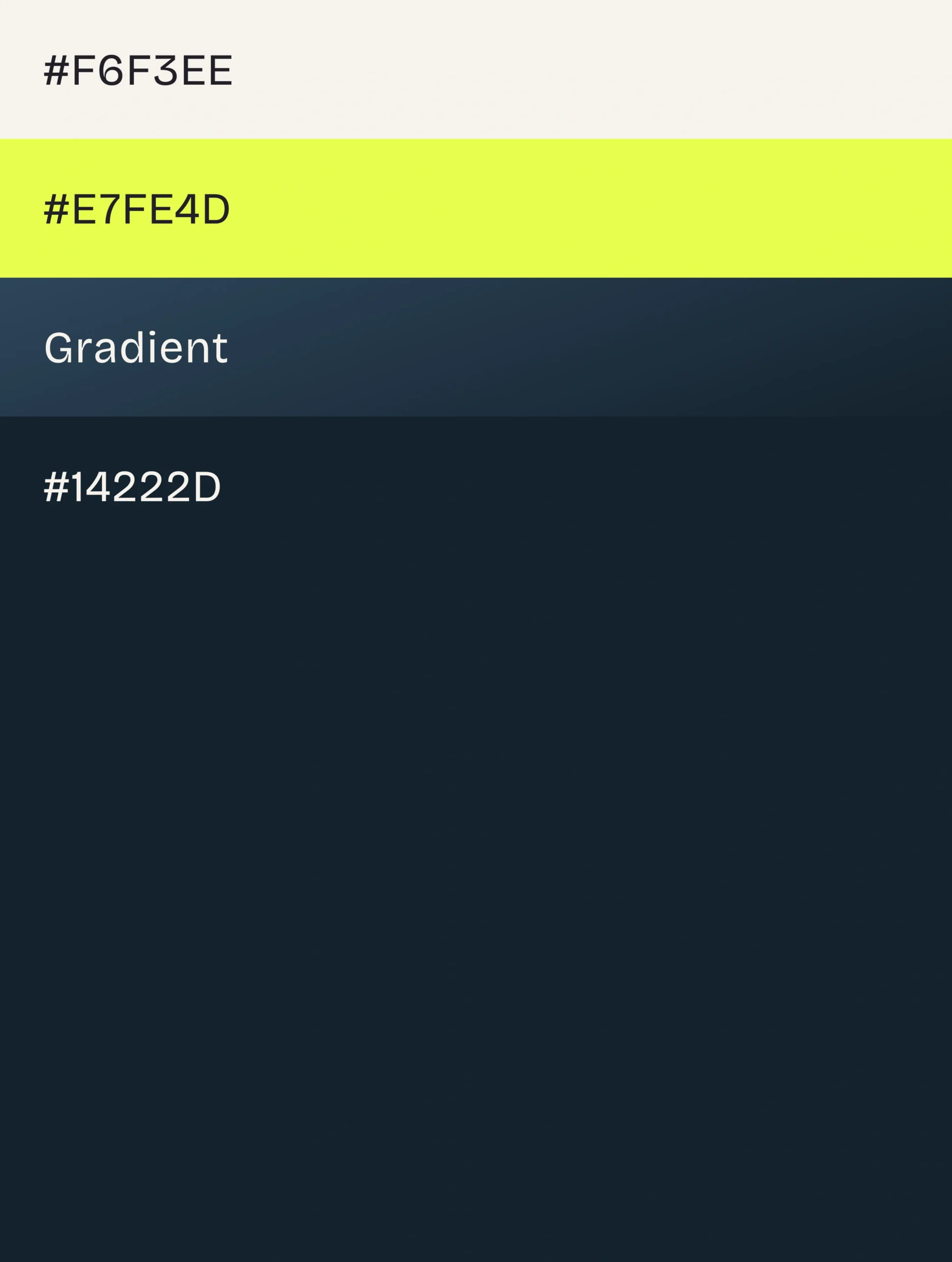
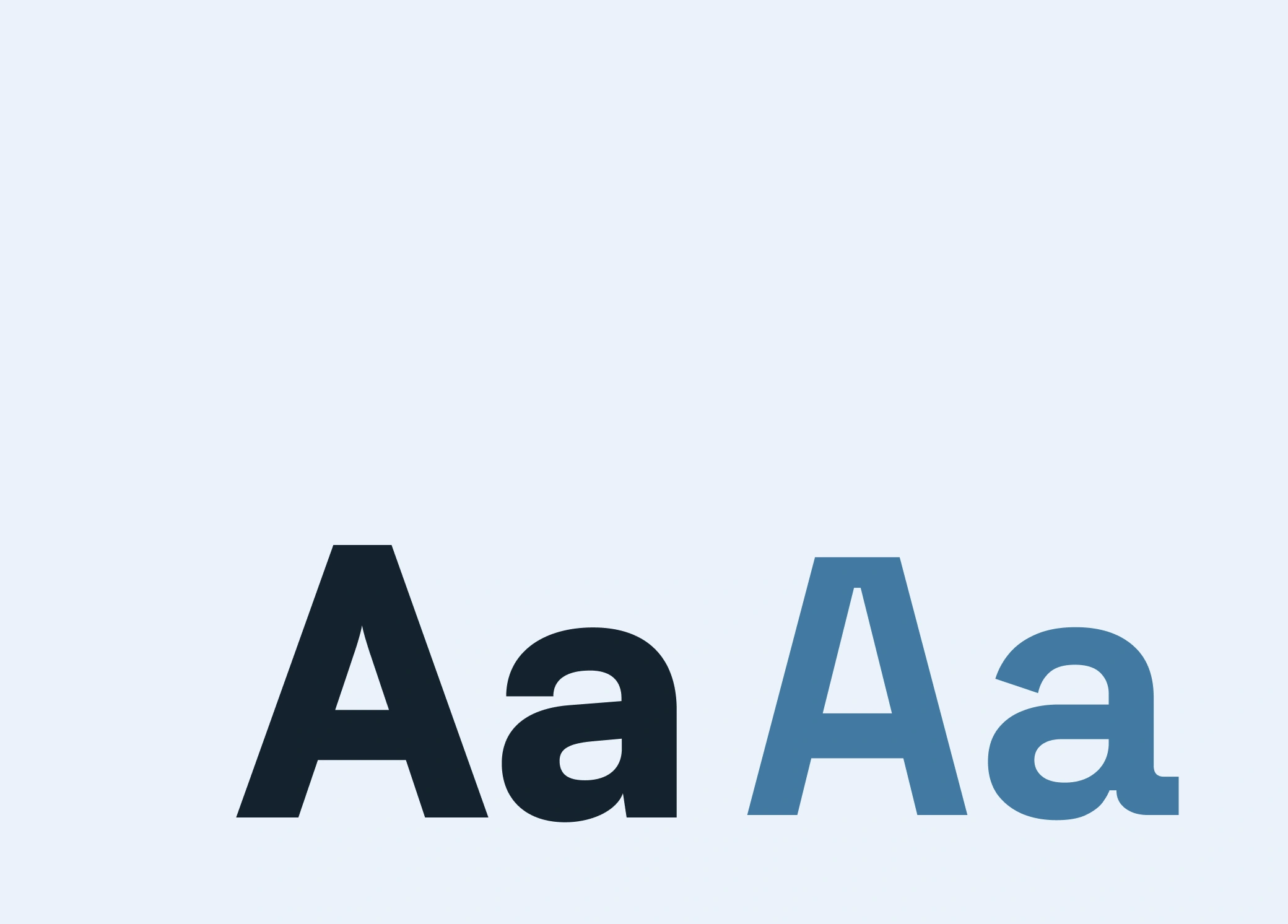
Resimator’s new visual identity bridges modern design with cultural resonance. Its nordic blue and neon color palette symbolizes trust and vibrancy, while the refreshed logo embodies the nepali roots of the company. The streamlined design extends across digital and physical touchpoints, reinforcing the brand’s promise of simplicity and reliability.